
About
REALRIDER® SOS is an advanced motorcycle crash detection app that automatically detects serious accidents and connects riders directly with emergency services when they are unable to call for help. Trusted by riders worldwide, the platform provides government-accredited emergency alerting across multiple countries, giving riders confidence that help is always within reach.
Beatnik Studio was commissioned to redesign the user experience and user interface, creating a modern, intuitive mobile application that makes critical safety features simple to understand and effortless to use.
The Challenge
When an application is designed to protect lives, usability becomes just as important as the technology behind it. Riders need complete confidence that the app is active before every journey, while emergency information, subscription management and profile settings must remain easy to access without distracting from the core purpose of the product.
The existing experience lacked a clear visual hierarchy and didn't fully communicate whether crash detection was active at a glance. Our challenge was to simplify the interface, reduce cognitive load and build trust through thoughtful interaction design.
Our Approach
We reimagined the application around a single principle: clarity when it matters most.
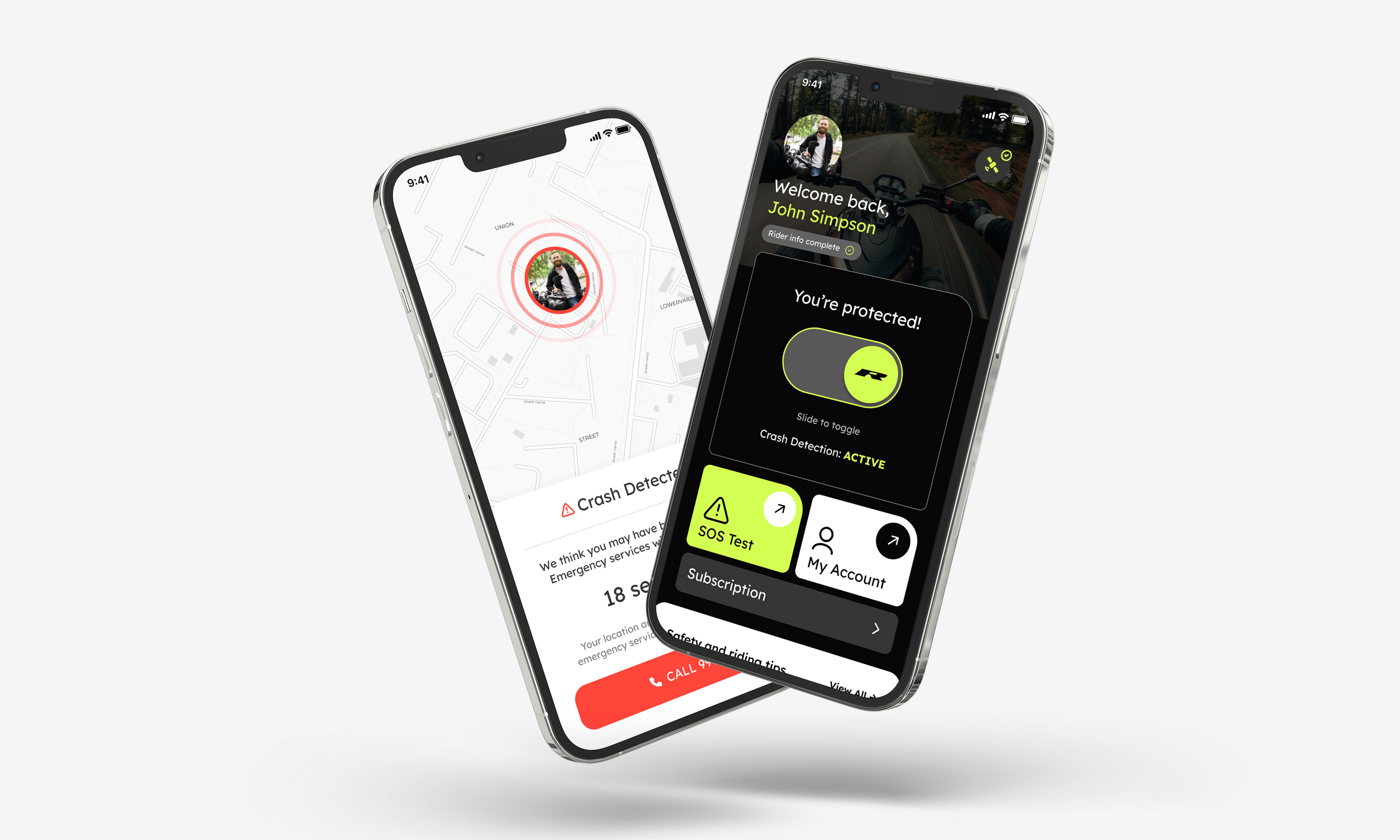
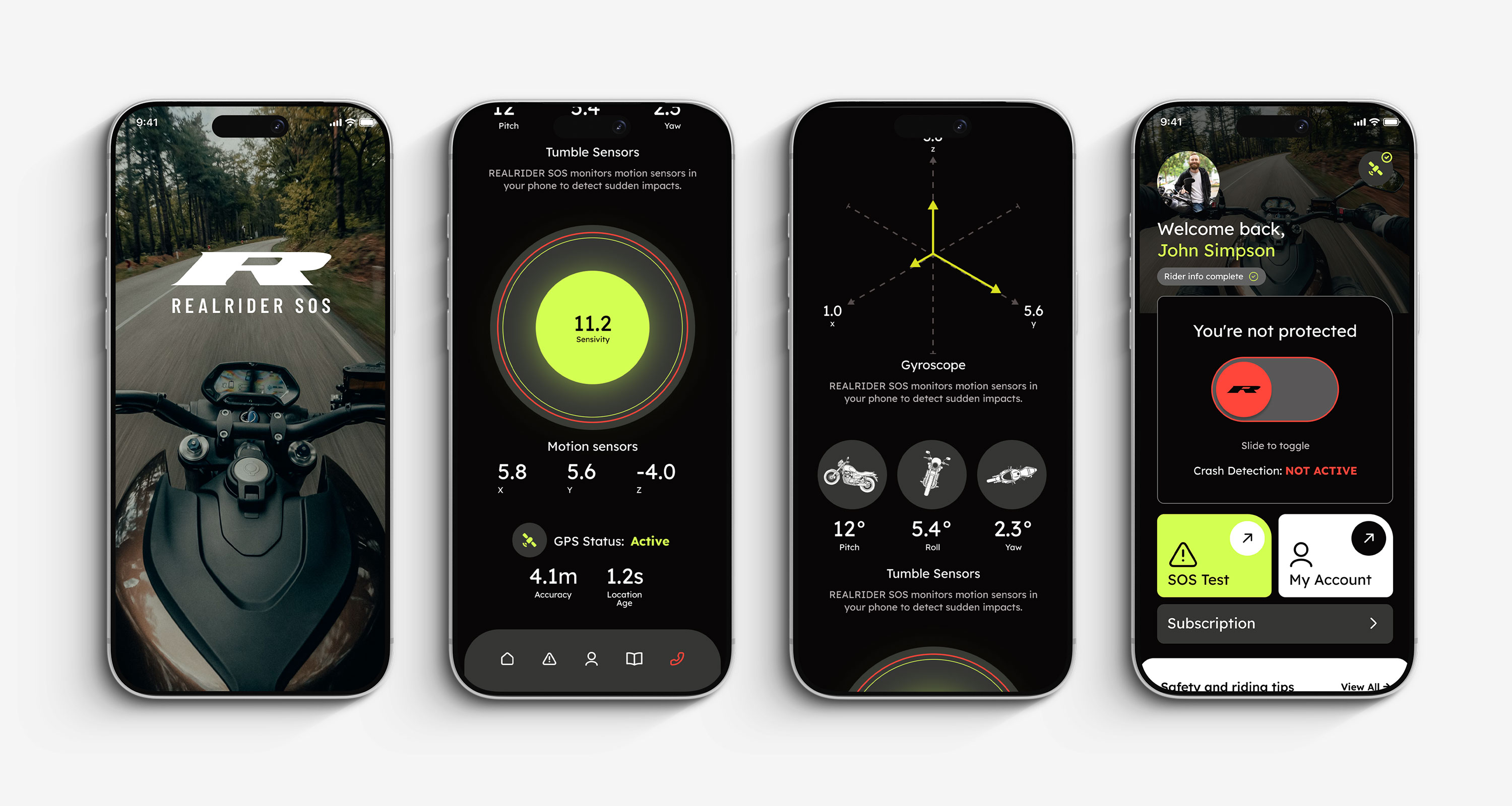
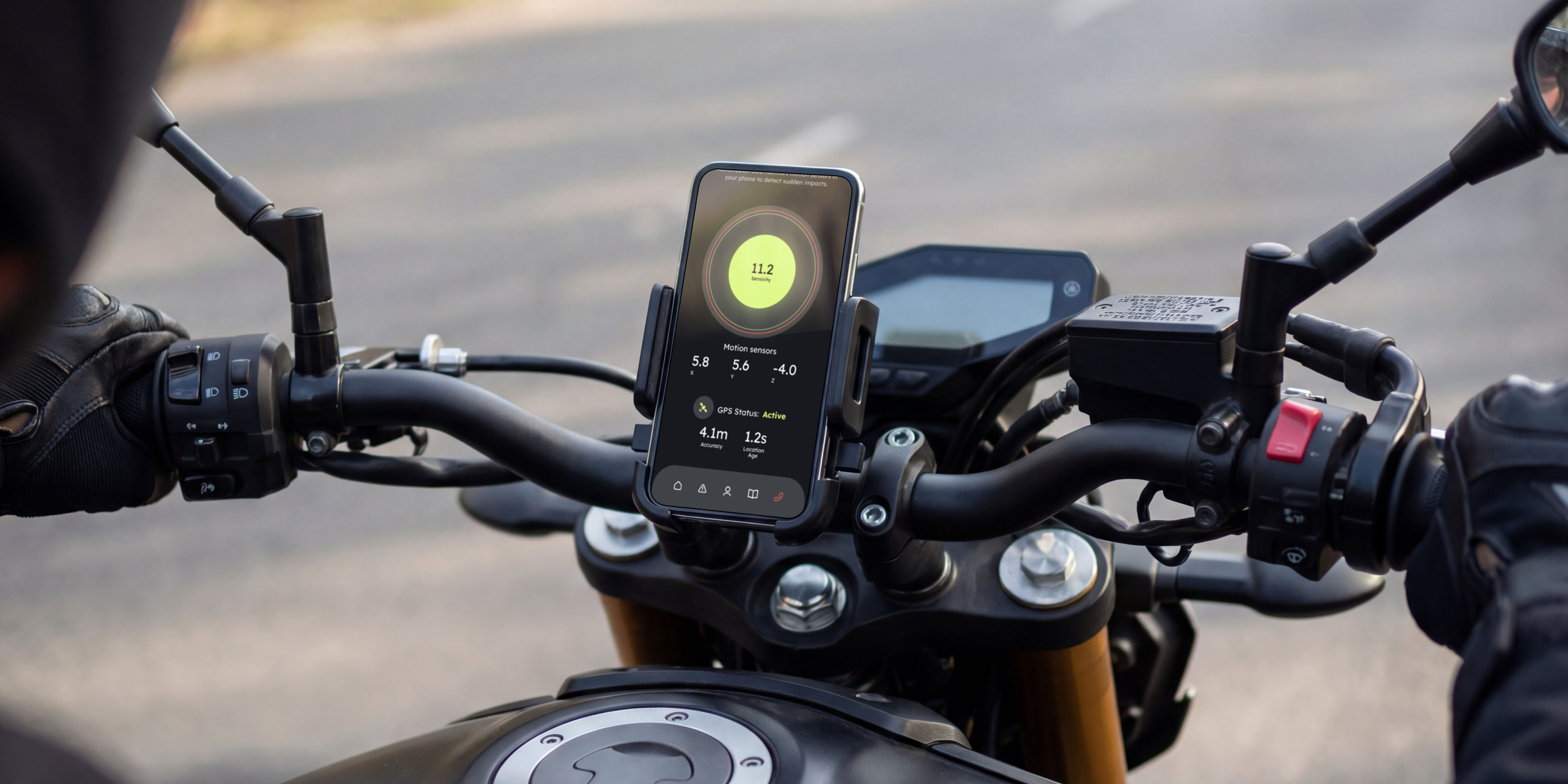
The user journey was simplified to surface the most important information immediately. Protection status became the focal point of the home screen, using bold visual indicators and a simple interaction model that allows riders to quickly activate or deactivate crash detection before setting off.
Supporting features such as emergency profiles, motorcycle details, subscriptions and account management were reorganised into a more intuitive structure, reducing friction while maintaining quick access to essential information.
The interface was rebuilt using a modern component-based design system, ensuring consistency across every screen while providing a scalable foundation for future development.
Design Principles
For a safety-critical application, every interaction should inspire confidence.
The interface uses strong visual hierarchy, high contrast and purposeful colour to communicate status instantly. Bright accent colours distinguish protected and inactive states, while clean typography and generous spacing reduce cognitive load and improve readability.
Rather than overwhelming users with options, the experience prioritises the actions riders perform most frequently — checking protection status, testing the SOS service and managing their emergency information. Every screen was designed to feel calm, dependable and easy to navigate, even under pressure.
Key Features
Outcome
The redesigned REALRIDER® SOS experience provides riders with a clearer understanding of their protection status while making everyday interactions faster and more intuitive.
By simplifying navigation, refining key user journeys and introducing a consistent visual language, the application now better reflects the reliability of the underlying emergency response technology. The result is a mobile experience that feels modern, trustworthy and built around the needs of riders, giving them greater confidence every time they head out on the road.
Do you have a project in mind?
Let's Talk