User experience and user interface design
Her Majesty’s Coastguard is part of the Maritime and Coastguard Agency. Responsible for maritime search and rescue within the UK, they prevent loss of life at the coast or at sea with 24/7 operations, more than 300 stations and over 2,500 volunteers.

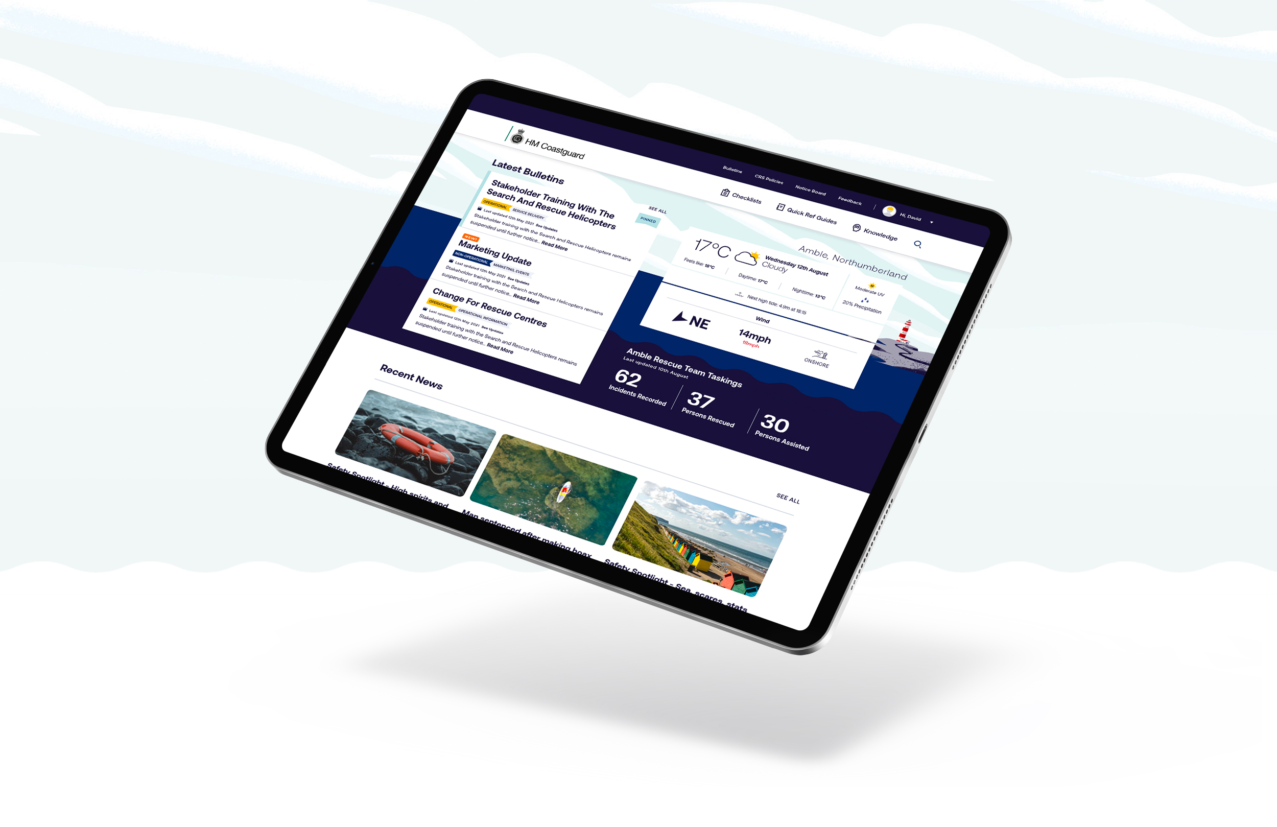
We were asked to map and design a responsive, accessible new knowledge base for HM Coastguard, working with our software development partner, Zaltek.
The existing system was out of date, inefficient and proving to be troublesome for its users. There was no clear process or information architecture set in place and no central point of access. Think sheets of paper, dusty ring-binders, a single user login on an old platform and downloading unorganised Microsoft Office documents… The current experience was stressful, with users finding it difficult to find important life-saving information when they needed it.

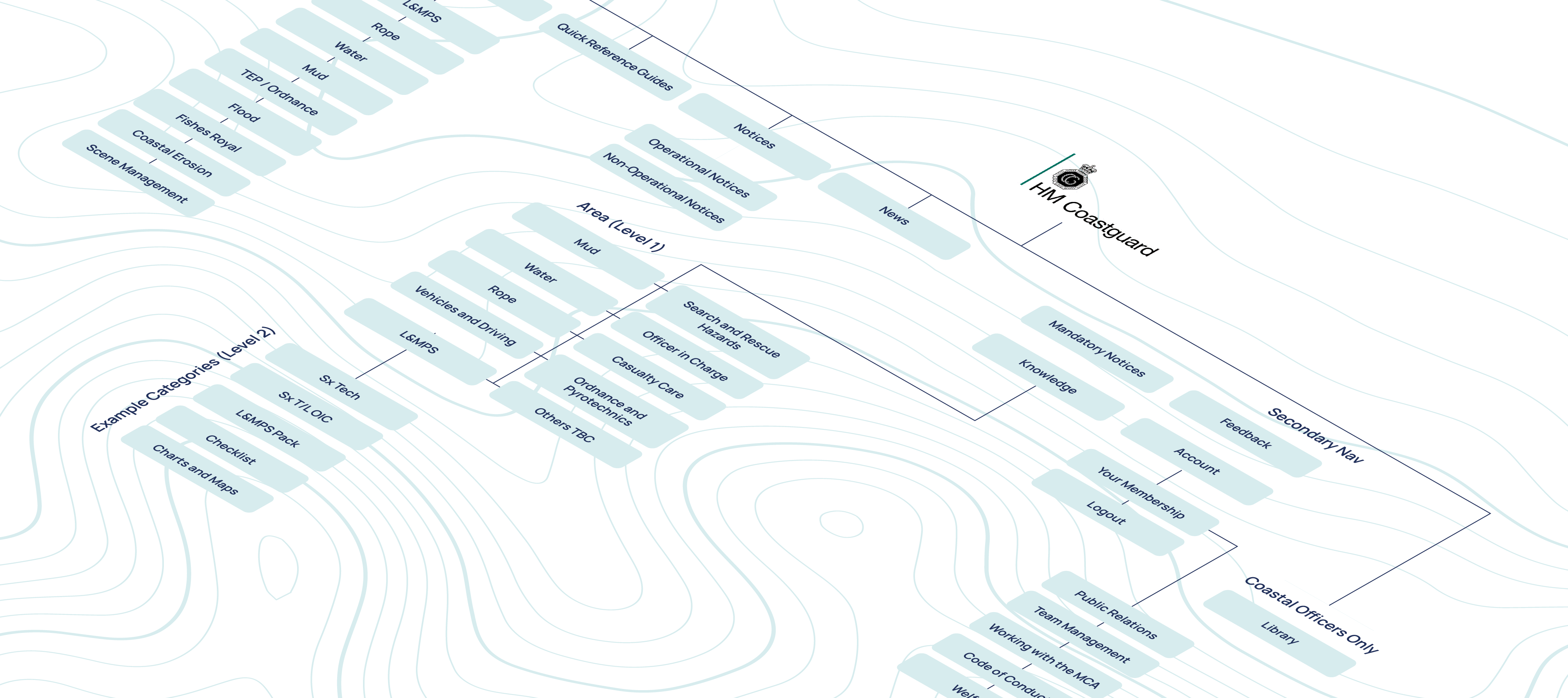
It was time for an upgrade to an accurate, accessible intranet of well-structured digital documentation. At Beatnik, we began by mapping out the full user journey and individual processes for each content type (manuals, forms and other important documents) into a new structure that shortened user endpoints from start to finish. Volunteers would now be able to access life-saving collateral with just a few clicks.
Users were asked to test our new website wireframes (a visual guide that represents the skeletal framework of a website, also known as page schematics or screen blueprints) so we could make quick, efficient iterations to our prototype.

With the knowledge base now mapped to be functional and user-centred, we began work on its visual communication. It was important that the design supported users in quick navigation and enhanced the system’s usability overall.

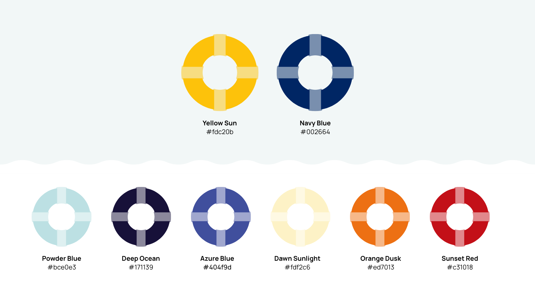
Colour Palette
HM Coastguard is a distinct sub-brand of the Maritime and Coastguard Agency with its own platform and application, but it is still very much interlinked with the primary brand and must remain consistent to it. To ensure connectivity between the brands, we used two primary colours from the coastguard crest as the lead colours to dominate all top level communications and created a secondary palette for data visualisation and smaller elements of the user interface.

Typography
We chose the font Aeonik for all body text, paragraph headings, captions and large volumes of informational text. Highly legible and well balanced for small text use, it offers flexibility while being clean, contemporary and expressing professionalism, confidence and inclusivity. To ensure consistency and clarity, we chose to only use the Light, Regular and Bold weights and their respective italics.
Following successful user feedback sessions with 50 HM Coastguard rescue operatives from around the UK, we transformed each wireframe template into high fidelity designs that adhered to Web Content Accessibility Guidelines and government standards for perfect accessibility.
Paper-based operations are now a thing of the past for HM Coastguard teams across the UK, who can now upload, share, access and understand information securely and accurately across all devices in a matter of minutes, not hours.
This project marked a successful beginning to the Maritime and Coastguard Agency’s digital transformation strategy to modernise operational procedures, guidance and documentation for all aspects of their rescue activities. Knowing the impact it has had to a vital and brilliant service, we were very proud to be part of it.
Do you have a project in mind?
Let's Talk