Transforming Brand Identity for Holistic Well-being
Introduction
Chuse, an emerging player in the well-being app market, embarked on a brand transformation journey. The goal was to develop a brand identity that effectively communicated its dedication to holistic wellness and its special role as a trusted tool for Blue Light organisations in the UK. Chuse aimed to differentiate itself in a competitive industry by addressing the unique needs of its diverse user base while emphasising its support for emergency service personnel in high-stress professions.
Client Background
Chuse, a startup company, recognized the need to enter the competitive well-being app market with a holistic approach to wellness. It sought to offer a comprehensive platform catering to mental, physical, and emotional well-being through personalized guidance, content, and tracking features. Notably, Chuse’s unique challenge was to distinguish itself from other well-being apps, while also fulfilling its vital role as a support tool for Blue Light organisations in the UK, serving emergency service personnel.

Strategic Approach
To address this challenge, Chuse embarked on a strategic journey. The approach included thorough market research to identify user preferences and the specific needs of Blue Light organizations. Chuse’s brand identity was meticulously crafted, reflecting core values of holistic well-being, user-centricity, and empowerment, while also acknowledging its role in supporting the well-being of emergency service personnel.
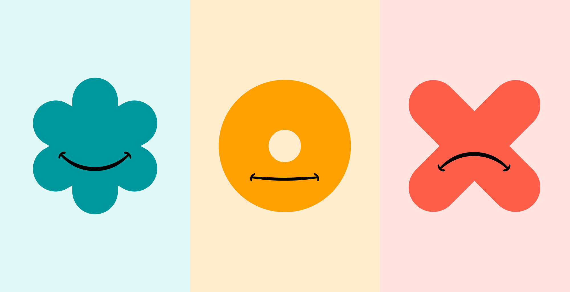
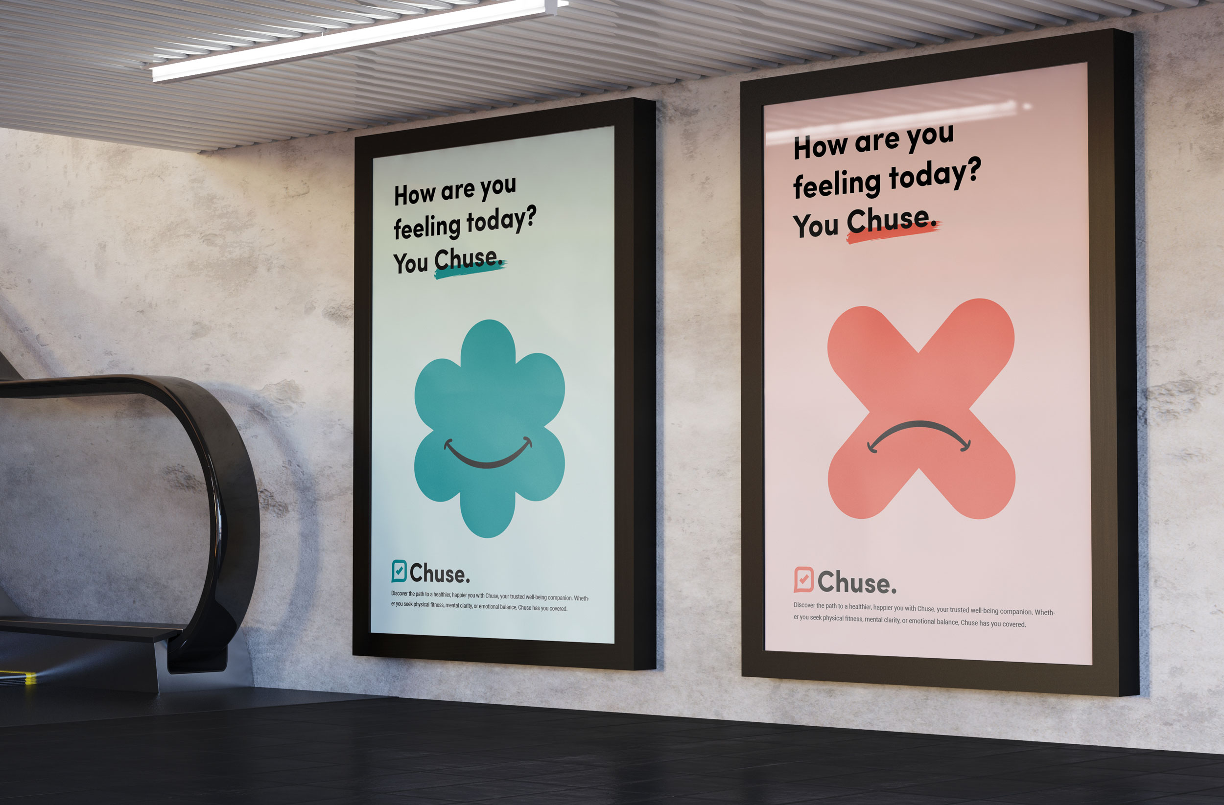
A calming teal-colored clover-shaped graphic exuding happiness with a broad, uplifting smile. This symbolizes the joy and elation of being in a state of optimal well-being with Chuse.
A warm golden-toned circular graphic, akin to a donut, showing a contented, neutral expression. It represents those moments of contentment and balance in one’s journey with Chuse.
A vibrant coral-colored crossed graphic marked by a pronounced frown. This captures the moments of sadness or challenge, emphasizing Chuse’s understanding and support during the lows of one’s well-being journey.
Primary Logo
The Chuse primary logo embodies two key attributes:
Trust Defined: The Chuse logo, paired with a tick symbol, serves as a visual representation of trust and reliability. This combination reinforces Chuse’s commitment to providing users with a dependable well-being platform, making it an ideal choice for emphasizing assurance and trustworthiness.
Modern Minimalism: The Chuse font logo epitomizes the principles of clean, modern design. Its minimalist approach ensures instant brand recognition, conveying a sense of sophistication while maintaining simplicity. This modern aesthetic aligns perfectly with Chuse’s focus on a user-friendly and visually appealing experience.
Conclusion
Through meticulous research, a thoughtfully crafted brand identity, and an empathetic design approach, Chuse transformed from a startup into a trusted player in the well-being app industry. The brand’s commitment to holistic well-being, coupled with its unique visual language and support for emergency service personnel, resonated deeply with users, making Chuse a valuable partner in their well-being journeys.
Do you have a project in mind?
Let's Talk