Transforming Deaconstar's Online Presence for Enhanced Accessibility and Engagement
Background
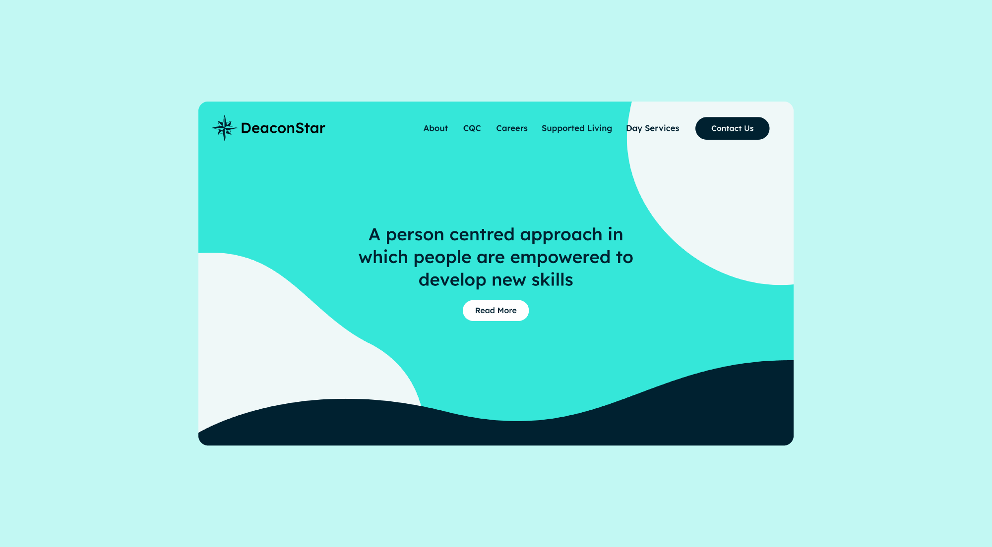
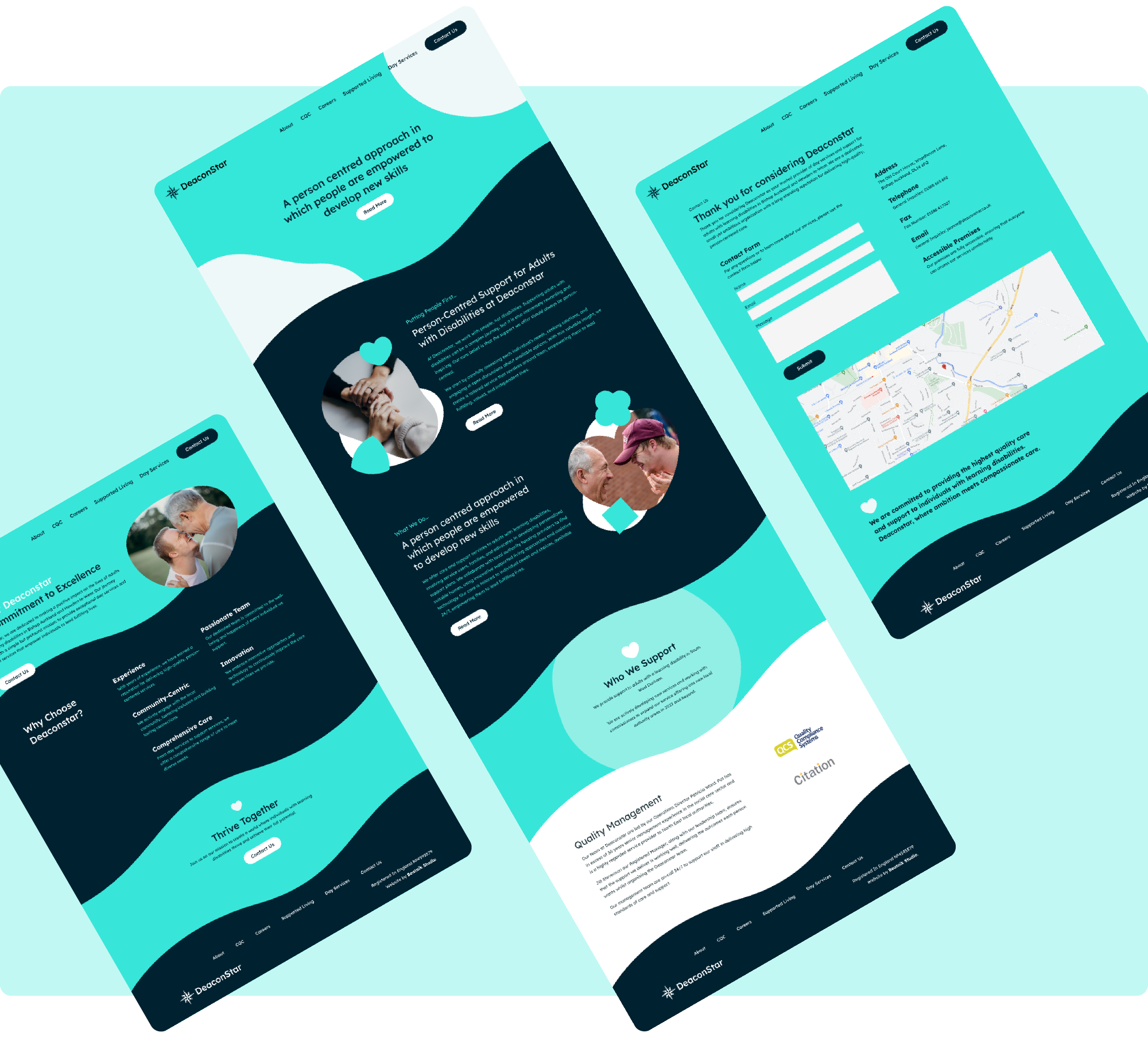
Deaconstar, a dedicated provider of day services and support for adults with learning disabilities in Bishop Auckland, sought to revamp its website. The primary objectives were to create a more user-friendly, informative, and engaging online platform that accurately represented Deaconstar’s commitment to person-centred care and community involvement.

Challenge
Outdated Design: The previous website had an outdated design that did not reflect the organisation’s progressive approach to care.
Accessibility: Ensuring that the website was accessible to all users, including those with disabilities, was a top priority.
Engagement: The site needed to be more engaging and informative for both potential service users and their families.


Enhanced Accessibility and Engagement
At Beatnik Studio, we’re passionate about creating web designs that not only captivate but also prioritise accessibility. In our commitment to improving web experiences, we’ve strategically integrated Montessori shapes into our designs, enhancing both aesthetics and accessibility.

A Revolution in Reading
In our quest to create websites that are both visually appealing and highly accessible, we recognised the importance of choosing the right fonts. That’s where Lexend came into play. Developed with a profound understanding of visual stress and reading challenges, Lexend fonts offer unique advantages.
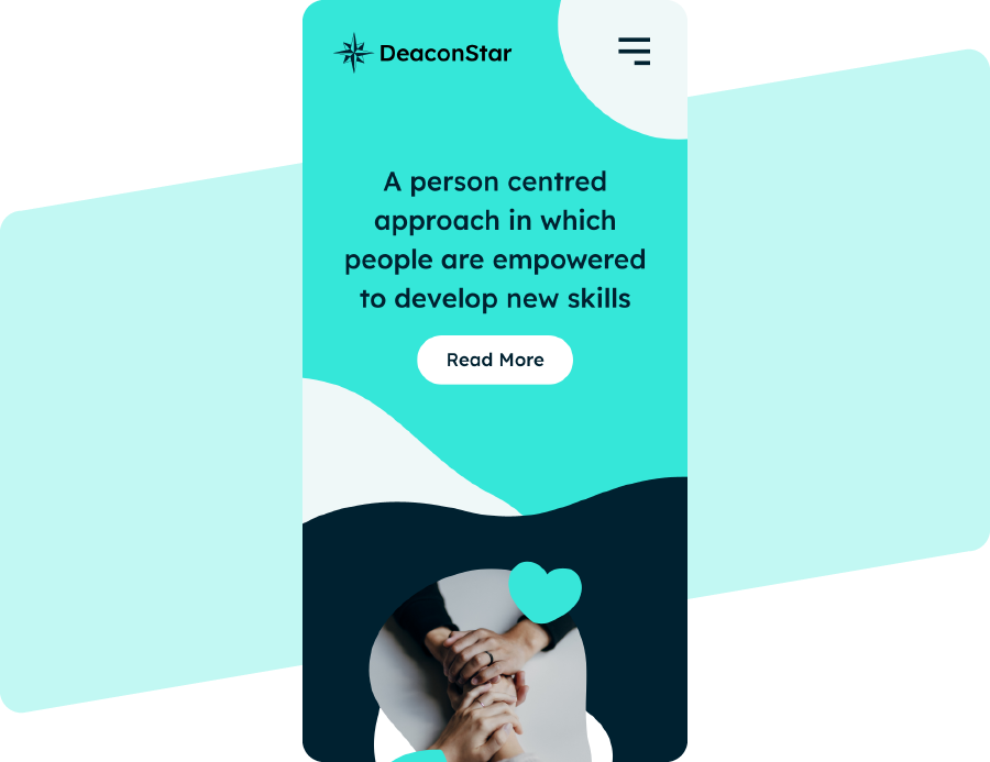
To address the outdated design and improve user experience, we adopted a modern, responsive design that adapts seamlessly to different devices, including smartphones and tablets. This change ensured that visitors could access information effortlessly, regardless of the device they were using.

Do you have a project in mind?
Let's Talk