Visual identity and responsive website
The Brief
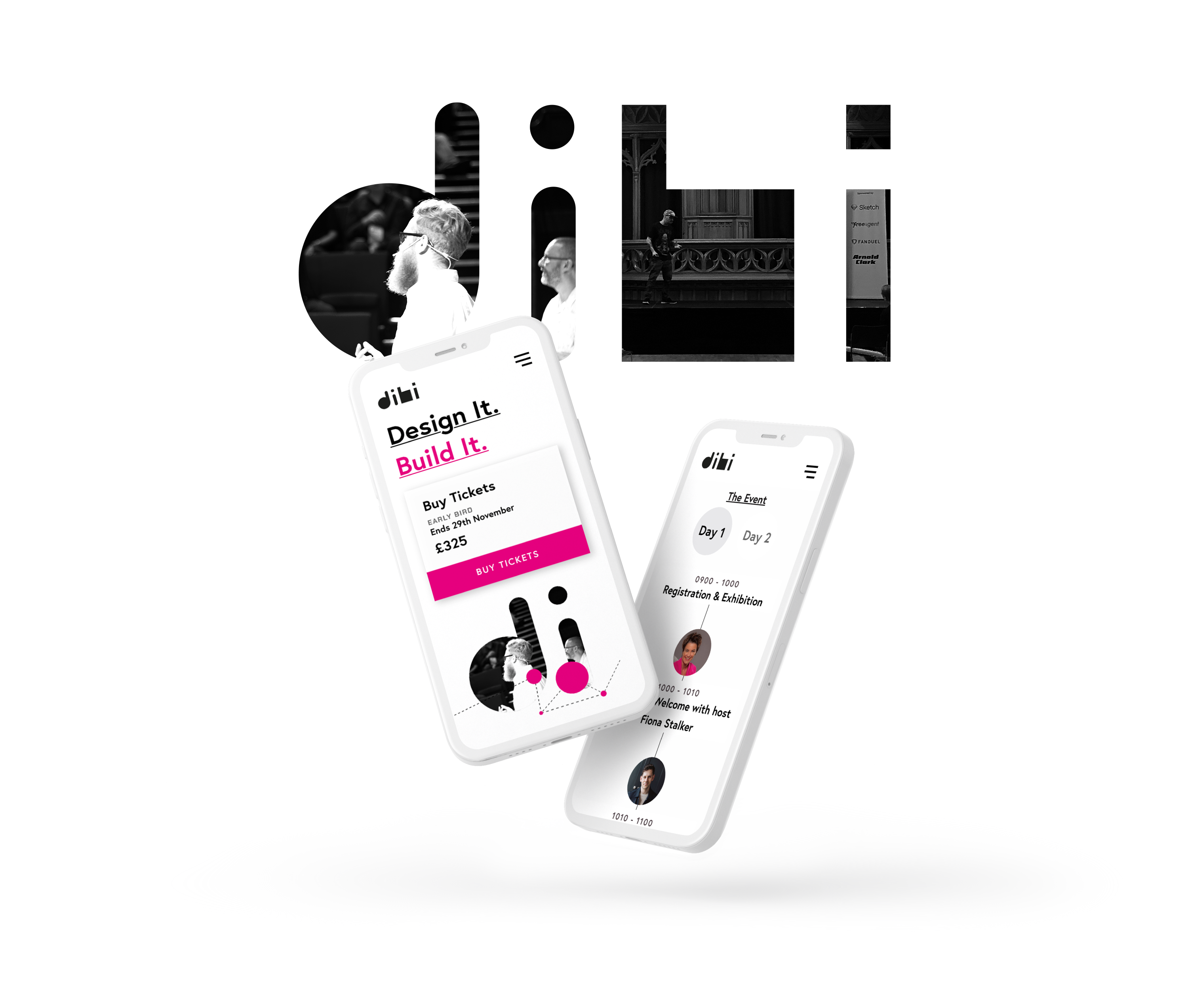
Dibi returned in 2022 with the need for a fresh visual identity and a new website. As one of the most established digital industry conferences in the UK bringing world-class speakers to a design and build audience, they required something original, contemporary and well executed.

The Idea
The DiBi conference is about informing, inspiring and connecting people within digital and tech. The first event since the pandemic paused in-person conventions, the theme of connection and reconnection felt more important than ever. We knew this should lead the re-brand.

The Visual Identity
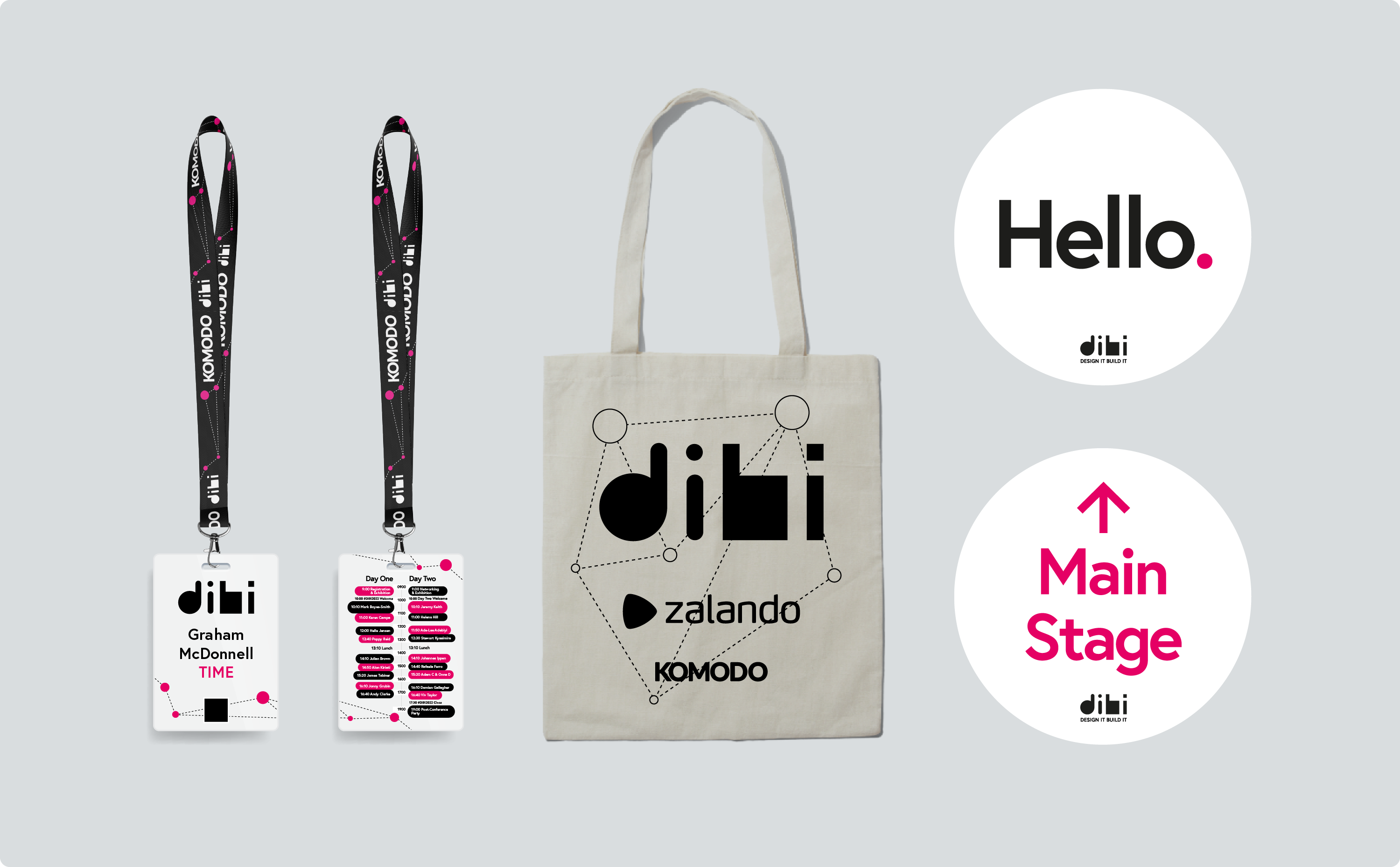
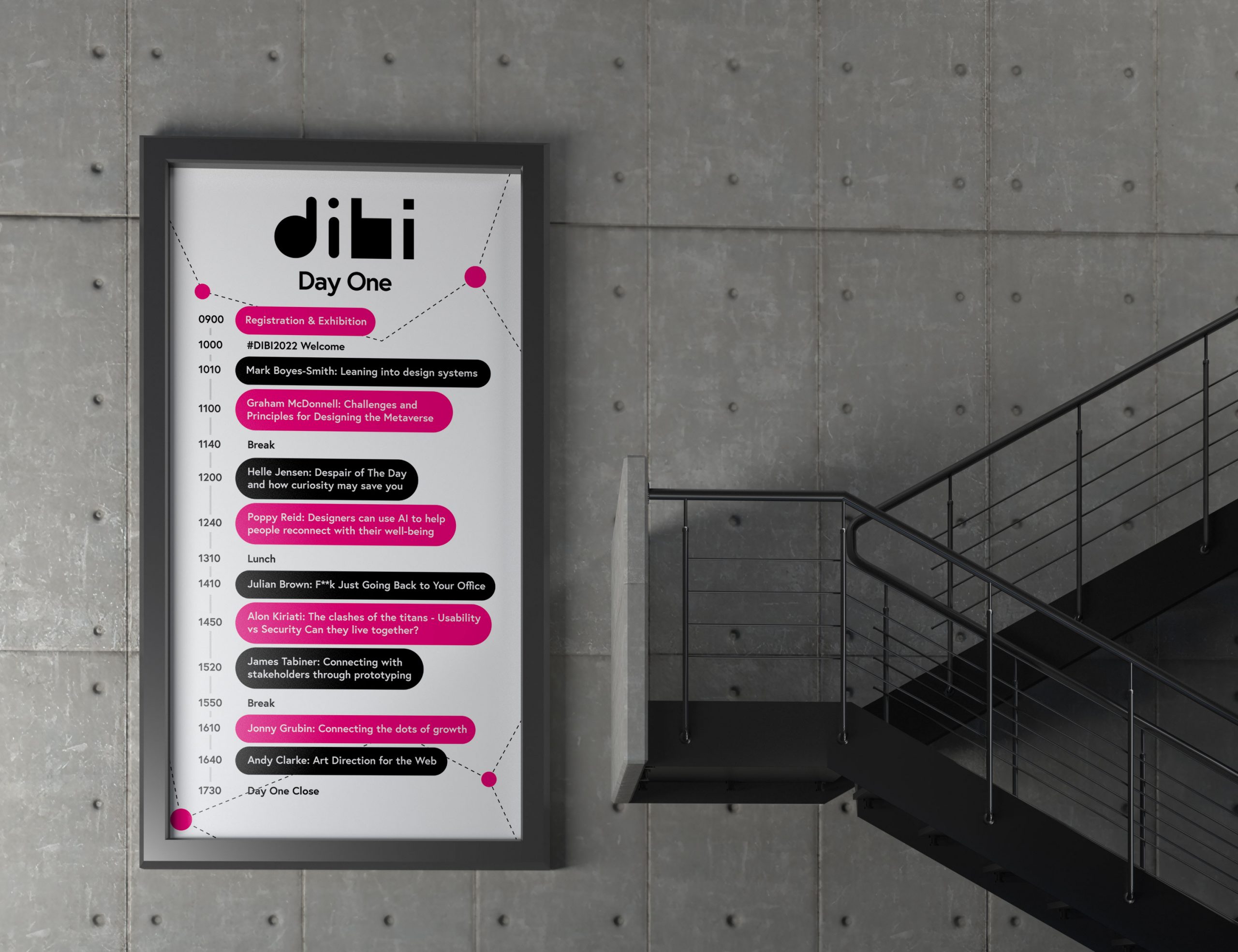
We developed a modern look to the connection theme, minimal but bold enough for a smart audience with a creative eye. All merchandise, posters, monoliths and lanyards coordinated our idea both on and offline, bringing everyone together with a joyful, festival feel.

The Festival CMS
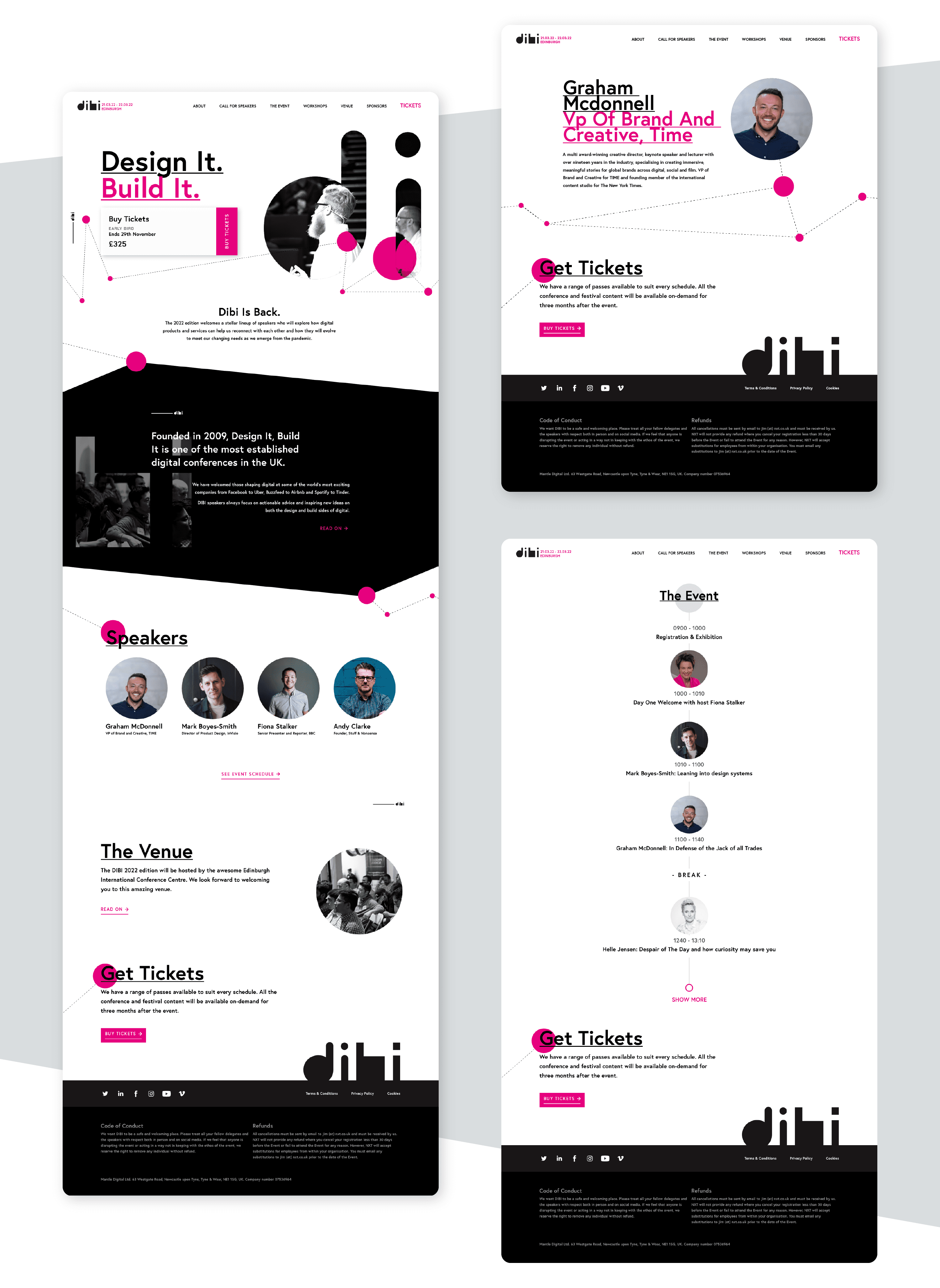
We created a sleek website and CMS for the DiBi team to provide a positive user experience for their tech savvy event guests, adding and updating speaker and programme information seamlessly for clear and cohesive event management.

The Result
The development of a striking new visual identity and responsive website with a robust CMS allowed the DiBi team to re-launch their annual flagship conference with confidence, coordination and class.
Do you have a project in mind?
Let's Talk